The pic on left is focusing on chair, not drink; (tap your smart phone screen to choose the focal point) it's too "cool" (blue) and not framed well (too much empty space in lower right corner). The pic on the right fixes all those problems.
Being a semi-pro photographer I have a thing about posting good pics on social media. But now being a business owner of downtown Kokomo's Main Street Cafe taking good pics for social media is imperative.
The basic tools needed:
- A good camera phone (eg. big difference between a 3G iPhone and 4G/5G iPhone)
- Camera+ app (Instagram will work if you take it easy on the filters/effects)
Now for some photo skills:
Good light.
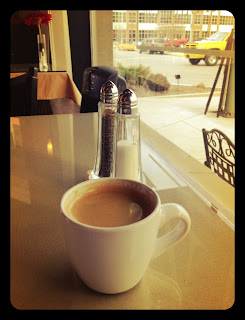
Every room with a window has good light, you just have to find it. Good light here means there's light on the front of the cup, beside & behind. That leaves sexy shadows on the left side of the cup. Good light often leaves some shadows, but doesn't have to. Good light will allow you to turn OFF the horrible flash on your camera phone. (Did you get that? Turn off your camera phone flash.)
If there's no light on the front of your subject, your subject will be dark. Side or back lighting enhances. Too much bright light will "blow out" your subject.
Frame it.
With the pic above I could have taken a picture of just the espresso cup. Instead I chose to include a bit of the vibe of our little bistro. Now, not just the espresso is attractive, but the ambiance is too!
The soup on the top sells the soup, but I think the soup that shows more of the table and window sells it better. These two pics are a good example of "cool" vs "warm." The top soup has a cool or blue tint to it (as it was shot). The bottom had a similar tint as it was shot, but a warm filter in Camera+ added a subtle amber color. Notice it's the same table in each pic yet a different color because of the filter/effect.
Crop it.
One way to frame and crop a pic is to use the rule of thirds. Most camera phones have these handy grid lines (or they can be turned on). The idea is to get your subject in the intersection of any of these lines. This is a GUIDELINE and not a hard and fast rule. The red box here is where I tapped the screen to choose the focal point. I added just 1/2 of an amber filter in Camera+ since this was in the shade and had a cool tint to it.
These two ice cream pics show the difference that 60 seconds of editing make in Camera+. When editing pics of food (or whatever your product) be careful not to OVER edit it. If you blast up the color and saturation to the point it doesn't look like food, you've missed the point. The point is to accurately capture what your product looks like in real life.
This close-up shot is ok, in that it sells the heart-shaped sprinkles but it's so close that the picture doesn't tell a very good story. This could benefit from better light and better framing.
Here's why this picture works: Good framing (the product is featured yet the outside seating calls your name). Good focus (the cookie is clearly the star, the espresso a supporting roll, outside furniture, the extras). The color of this picture is warm and inviting. It was taken on an overcast grey (blue color) day. A warm filter in Camera+ enhances the product. A frame in Camera+ that adds to the feel of the pic, completes it.
Recap:
1. Good lighting. Find where it is in your business at different times a day. And remember shadows are sexy.
2. Frame it. Feature your product but give us a glimpse of your location. Think story, not just product.
3. Focus. Tap your screen on your subject. Our eyes go to what's in focus.
4. Edit. Crop it and enhance your product with filters/effects but don't over-edit. Think about the temperature of the pic. Does cool or warm serve it best? Does it look like your product in real life?
5. Experiment!


